
Color for the Color-challenged
Read this if you suck at picking colors
Introduction
Rather than placing web folks into the bucket Developer or Designer, I think many people would find themselves somewhere in the gray zone in between, not at the extreme ends.
I most certainly feel that way about myself. I’m primarily a developer, yet with some creative tendencies (I used to draw a lot when I was younger and I’m passionate about photography). I also like to think that I have acquired somewhat of a taste for good design. Meaning, I can tell apart good design from bad design.
But I definitely fall short of the skills of a schooled and/or talented professional designer to create a good design. They operate at another level. So that means that in cases where I’m tasked with design work, I have to compensate. Fake it, basically.
When you lack specific design skills or talent, it’s very well possible to compensate for it, here’s a few strategies:
- Engineer it. Several aspect of design are bound by rules and guidelines, all of which can be learned. Examples I can think of are in layout and typography, there’s several best practices one can simply reuse. Part of design is math.
- Brute-force it. Although inefficient, you can keep re-iterating until you have a design that is good. The sheer determination approach.
- Steal or reuse it. Preferably in ethical ways. The go-to method. This could mean reusing an entire framework (say, Bootstrap), an approach, or to take inspiration from the great work of others, and then tune it to make it your own.
So there are ways to bridge the gap, but there is this one aspect of design that I cannot seem to master or fake: Color. Color has to be the most artful and emotional aspect of design, making it very hard to replicate. And it’s not just artful, it’s also technically complex. Color theory is hard, and full of pitfalls.
Simpler put: when I’m tasked to pick a color palette or scheme, I typically iterate forever, and still will be displeased with the result. I’m aware of the many tools that aid in this task, yet those results often still break down when put to real-world usage.
In other words, I’m color-challenged. And if you are too, maybe this article has value.
Should I bother reading this?
This is going to be an extensive article with an overload of text, and color. I better try to sell it to you now, leaving you to decide whether this is worth your time. Here are the main parts:
- Chapter I:
The release of a large, very widely usable ready-to-go color palette that is attractive, well-behaving and extensible. It is based on the fantastic work done by the creator of Open Color, with a few extensions added. - Chapter II:
A theoretical part on how to judge and rank color palettes by various characteristics, strengthening our understanding of color. - Chapter III:
Discussing the extensions I added to Open Color, and why. - Chapter IV:
Probably the most interesting part of the article: squeezing optimal value out of the color palette by means of many advanced real-world tests and great helpers to utilize the color palette the best we can. - Chapter V:
An explanation of techniques to extend or replace the palette with your own hues, in a way that keeps the integrity of the entire palette intact.
Chapter I: The Color Palette
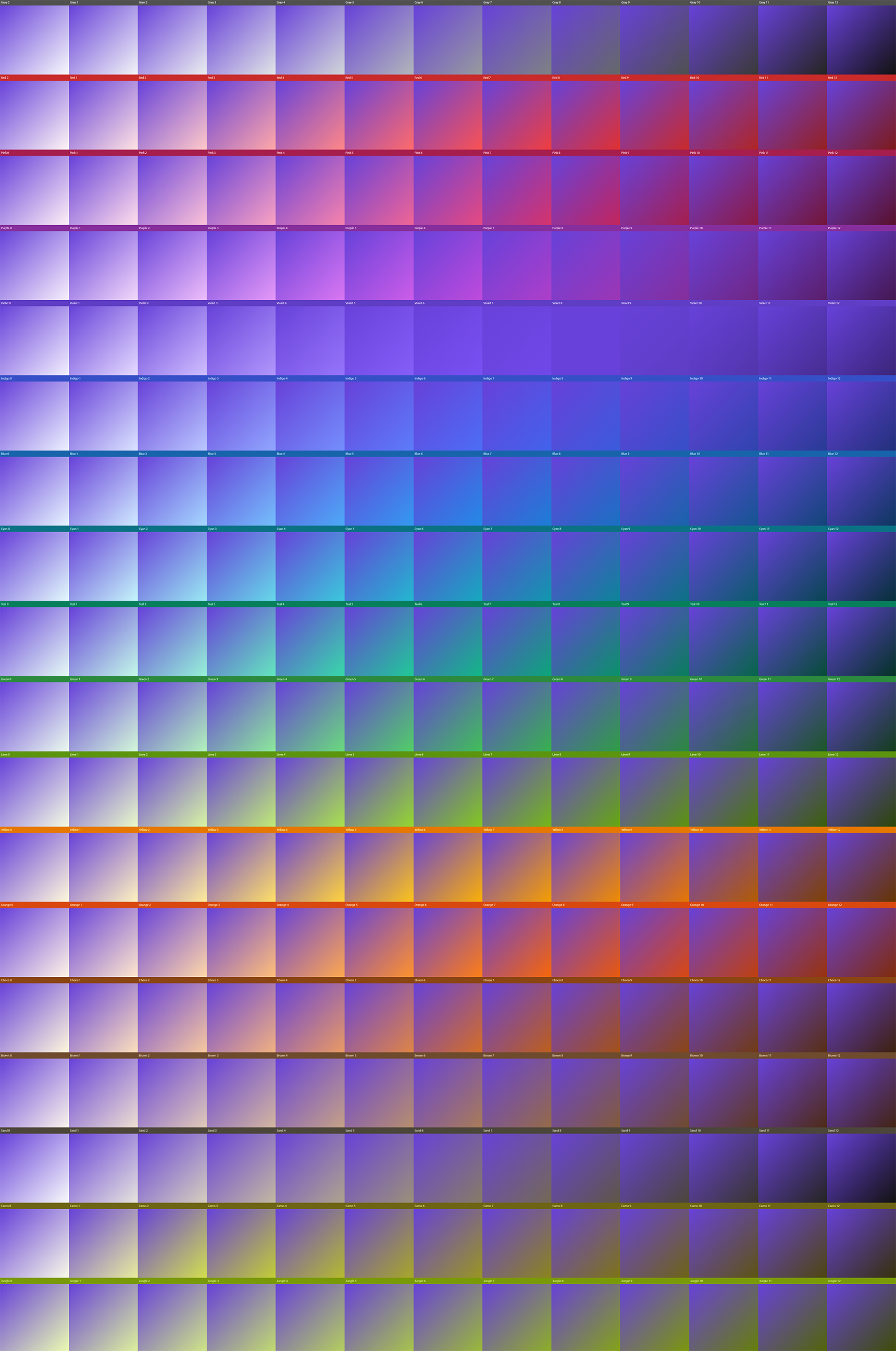
For those wanting immediate value, let’s first release the end result, a big palette of 234 colors (18 hues x 13 luminosity steps). It is an intentionally large and wide color palette so that its potential applicability is wide. It can be used for web and app design, illustration, and possibly also print.
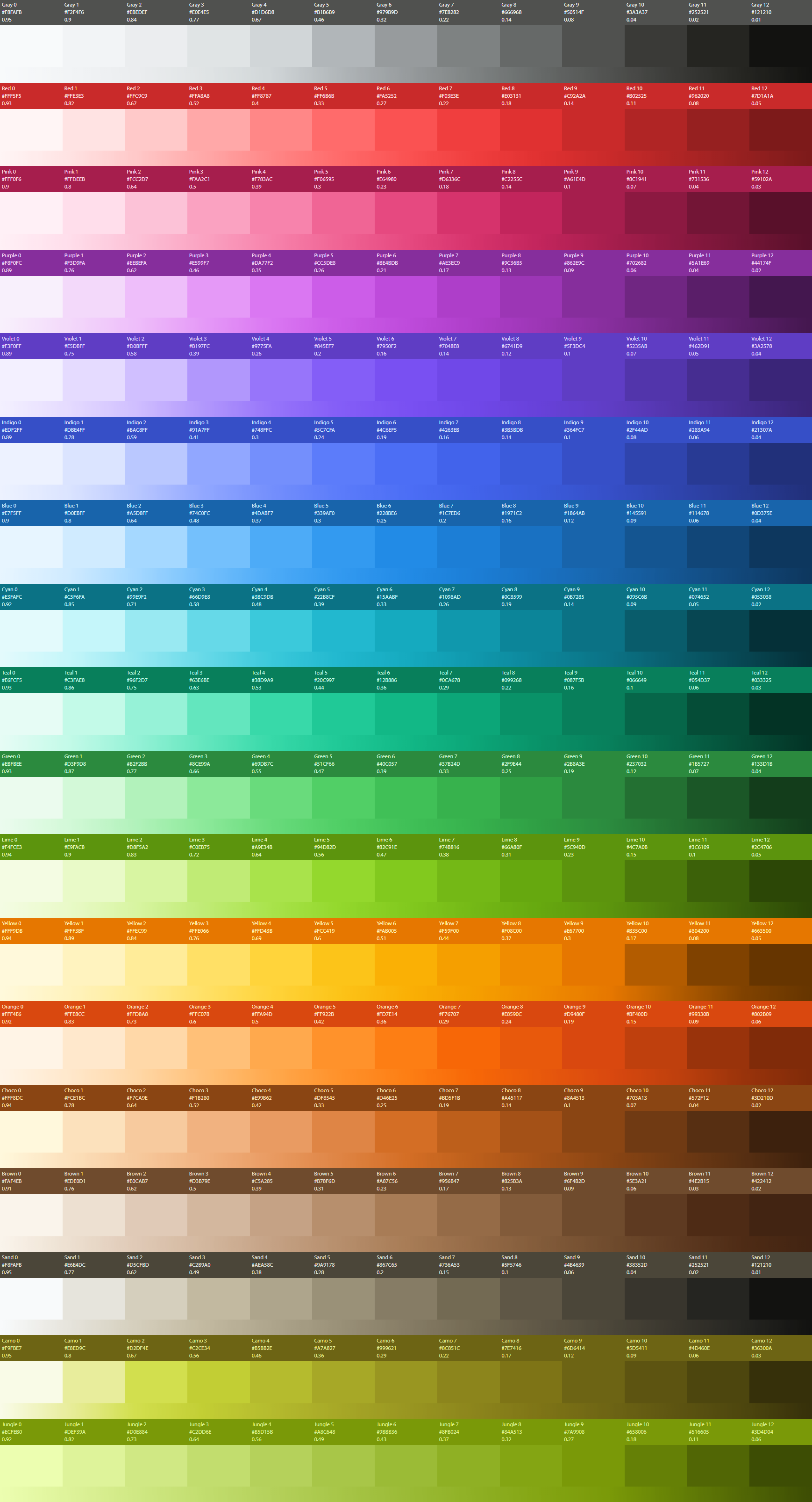
A quick explainer on how to read the palette:

A single hue has 13 steps (I’ll explain this weird number later on) in its widest form, but I’m also sharing compressed sets of 7-step and 5-step palettes. Each color has a name, numbered from high to low luminosity. The hex code is shared for each tone. The number below the hex value is the luminosity value which indicates how bright the color is perceived. Luminosity is not to be confused with brightness or lightness as found in the HSL color system. The L in HSL does not represent luminosity as experienced by human vision.
Below each color row you’ll find a gradient band that runs a smooth gradient based on the 13 steps. This allows for two things:
- In the odd case where you need an in-between value, you can pick it from the band and do so in a way that roughly respects the curve.
- It’s a great checksum for the consistency and integrity of the palette. If there’s any weird jumps in hue, saturation or luminosity from one step to the other, the band will not appear smooth.
I don’t know about you, but the addition of the gradient band to me creates the illusion of the main color tones being a gradient as well. I can ensure you that they are solid colors. Color is weird. Or brains are.
Here’s the 7-step palette:

This smaller palette has the same begin and end value, just less steps in between. Here’s the even more compressed 5-step system:

Now, let’s share this palette in more useful ways, allowing for easy integration in your workflow. For example in Photoshop:

I’ve created a repo here. The palette is shared in the following ways:
- .aco: Photoshop
- .afpalette: Affinity Designer
- .ase: Adobe exchange format
- .json: For scripting
- .php: PHP array format
- .png: high-res screenshot
- .scss: For (S)CSS integration
- .sketchpalette: Sketch (did not test it, don’t have a Mac)
Take and use as you please. I do want to put a giant disclaimer here. The repo should not be seen as a fork of Open Color. I simply needed a place to store these assets publicly. I named it “Colar” because I needed to name it something. It’s not a repo I will maintain, it’s a one-time dump of assets to supplement this article.
Likewise, I do not claim any ownership or credit for the end result, the truly hard work has been done by @Yeun of Open Color. Be sure to thank her if you use this. This article takes her fundamental work and:
- Extends it to make it suitable for wider usage (more steps, more hues)
- Discusses advanced methods to utilize the palette
- Discusses ways to add your own hues in a consistent way
Maybe some of these ideas make it back to Open Color, maybe not. In any case, Open Color should be seen as the active project, and credit belongs there.
Chapter II: Characteristics of a Color Palette
With the palette sharing out of the way, we’re now going to discuss what makes for a good color palette. We’ll find out that this depends on intended usage, and we’ll also discover that it’s quite impossible to serve all goals, as they can be at odds with each other.
Once again I need to praise the work of others. Much of this chapter and my newfound understanding of color systems is based on this article, which I consider required reading:
With this in hand, we’re going to explore the following characteristics of a color palette:
- Attractiveness
- Completeness
- Themability
- Equal distance colors
- Accessibility
- Extensibility
We’ll be discussing these characteristics based on the Open Color palette, yet you can use this understanding to analyze any color palette.
Attractiveness
A color palette has to look good, it has to be attractive. A palette may score well in secondary aspects, yet if it looks bad, everything falls apart. So I’d say attractiveness comes first, before anything else.
Part of attractiveness is subjective of course, based on opinion, culture, fashion. Yet there are still ways to distinguish one palette from the other when it comes to attractiveness, or perhaps elegance. To explain, I’m borrowing some screenshots and conclusions from the aforementioned article:

Above is Google’s Material Design red hue plotted on a saturation/brightness scale. The values on the scale seem to appear without much of a plan. Worse, if you look at the actual colors on the left, they seem all over the place. As if three different red hues are mixed into a single set. It’s possible that some advanced research has led to these color choices, but I most certainly am not detecting any artistic thought or elegance here.
Now compares this to the Open Color red hue:

Clearly the visual consistency is better here, supported by the elegant curve that seems to have an artistic thought behind it. These curves are optimized for each hue:

You can’t apply the same curve to every hue because human vision does not work that way. The creator of Open Color has handpicked ideal, elegant and attractive tones on curves optimized per hue. Doing this is not only a lot of work, it also demonstrates a deep artistic understanding of color, that I surely lack.
This is why as it comes to attractiveness, I rank Open Color very highly, and for my personal needs, the highest.
Optimizing for attractiveness may come at the expense of other characteristics. Whether this matters at all, depends on your usage.
Completeness
A simpler characteristic to judge a color palette by is color completeness. This simply means it has the hues that you need. Open Color is fairly complete as a general purpose palette yet is lacking in some ways. For example, it lacks any browns. A big part of my extensions is adding a few hues, as well as explaining how you can add even more, easily.
Themability
The themability of a color palette comes down to consistency in luminosity values across hues. Example:
Say we make a button and give it the background color Teal-6, with foreground text using Teal-1. If we’d now make a second button using the same color steps from a different hue, we might use Green-6 and Green-1, respectively.
What we do not want is for such a hue switch to lead to a big difference in contrast. For contrast to remain consistent, for the sake of legibility and accessibility, the luminance of each color should be the same (or close). Green-6 should be roughly as “bright” as Teal-6. Which is true in the example above (check the luminosity numbers).
Does Open Color support this equal luminosity requirement across the board?
The short answer is that Open Color largely meets this goal. Not perfectly, but largely so. The devil is in the details, so let’s dive a little deeper.

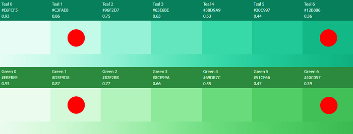
Above is a gray-scale conversion of the palette. At face value, there seems to be quite a few brightness deviations, yet things are not as bleak as they seem:
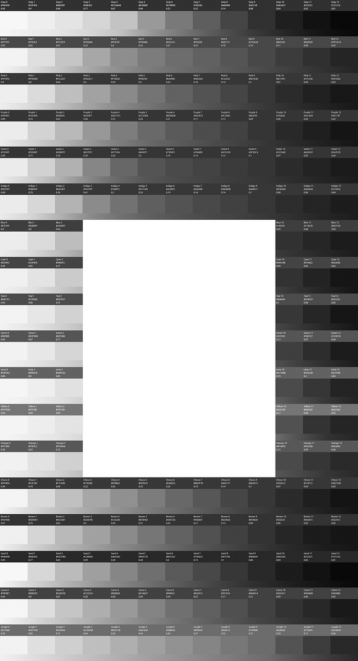
In general, the palette has a roughly equal brightness with minor differences being manageable. However, a specific subset of hues has larger deviations, and within those specific hues, the problem cases are all in the mid-level colors. The white block in the image above marks the problem cases.
Why are there luminosity inconsistencies specifically in that block? This illustration does a great job explaining the root cause:

On the right is a simplified color wheel as would be used in the HSL model, where the main hue is at a certain degree of the wheel. On the left is the gray-scale conversion with luminosity numbers.
To pick two extremes, yellow is at 94% brightness, blue at 44%. Perceived brightness is not at all uniform at equal starting points, it depends on the hue, as well as the saturation.
This has an important implication. If like me, you were happy with the HSL model as a much more understandable way to manipulate color compared to RGB, there’s some bad news. If you’re using the Lightness part programmatically, you should realize that it does not take into account perceived brightness at all. Perceived brightness is the result of all 3 values, not just the lightness value. This means the following does not work:
- Take two colors of equal brightness and manipulate both with the same Lightness change. The result will not be two changed colors of equal perceived brightness.
- Take one color and manipulate its Lightness in equal steps (say lower 5 times by 0.1 Lightness). The result will not be a palette where the perceived brightness change between steps is consistent.
Guess which hues in our brightness test as marked by the white block are problematic? The bright hues, running from teal to orange. These are simply hues perceived as bright by human vision, there’s nothing you can do about it, other than to reincarnate as a Praying Mantis. Yet you wouldn’t be able to read the rest of this article, so let’s postpone that for now until after the clapping.
What can we do about this problem, and how much of a problem is it really to not have perfect equal brightness across all hues?
Well, that depends on your goal. If you want equal brightness across the palette in order to be one-to-one themable, you could throw out some colors, for they are simply not suitable for it.
Yellow is a great (bad) example. If we would apply equal brightness rules to yellow, Yellow-4 would roughly require a luminosity value of 0.3–0.4. We would then have theoretical brightness consistency with the rest of the palette.
The problem: yellow at 0.3–0.4 brightness is already a dark orange, close to brown even. So it fails to be a yellow after step 4, and then we still have several steps to go. The theoretical consistency would be a case of “surgery successful, yet the patient died”.
Rather than throwing out these colors, Open Color takes the approach of following a different brightness curve for these bright hues. It favors color completeness and attractiveness for these special cases, and I think this is a great approach.
Does this hurt the palette being themable for these hues? Not necessarily. You could have a mapping system in place, like below. We’ll use the example of a button again:
- Blue theme (background: Blue-7, foreground: Blue-1)
- Yellow theme (background: Yellow-9, foreground: Yellow-3)
So just because these hues are not one-to-one themable, does not mean they aren’t themable at all.
Equal distance
Here’s a characteristic of a color palette that can be important, but often isn’t:

The question is: are luminosity changes to the next color step of equal size? Is the luminosity change a constant?
No, they are not in this color palette. For example, the jump from Teal-1 to Teal-2 is a luminosity change of 0.11, whilst the jump from Teal-7 to Teal-8 is a change of 0.7. So it’s not a constant, and we kind of already knew this because of the curves discussed earlier.
I can’t think of important use cases where this matters, it seems a theoretical characteristic only, one that directly conflicts with our very first goal: attractiveness.
There is, however, a secondary question you can ask here instead: is the luminosity change of adjacent colors large enough for human vision to clearly distinguish each color if they were put directly next to each other?
Here’s a use case where the answer to this question matters:

In charts and maps, the luminosity distance between color steps matters for users to be able to distinguish them clearly from each other when used in close proximity.
Does our palette support this use case? It depends. The luminosity steps in the 13-step system are too small for all of them to be used in this way. Yet the 7-step system would largely meet this goal, as it has larger jumps in luminosity.
Accessibility
When a color palette is used for the display of typography, and using the palette colors for either the foreground text or background color (or both), accessibility comes into play. Accessibility in this case refers to the contrast between both colors in order to express how legible the foreground text is. Legibility in turn is a function of said contrast, text size and how wide (or narrow) you define your audience in terms of eyesight.
Well, no. Let me correct that last part. It’s a common misconception to think of “poor” eyesight as a fixed physiological shortcoming affecting a subset of people. It’s not just physiological, it can also be situational.
Imagine having a major hangover whilst being in full daylight outside staring at your mobile phone of which you turned down brightness since it’s almost out of juice. Is contrast still strong enough for you to read the text in these conditions? The situation has reduced your ability to read text despite having good eyesight in general.
I know, it’s a crazy example. People don’t really go outside.
So how does Open Color rank when it comes to contrast? To be honest, not that great. I’ll go into more detail in another chapter when we test this, but for now let’s briefly discuss high level conclusions.
Roughly, the first 3 columns are bright enough so that when you place dark text on top of it, it would meet minimum contrast guidelines. For a few special bright hues (like yellow), this may go into step 4 or 5.
The middle group of colors, about step 4 to 8, are deep, beautiful, vibrant tones yet would fail the contrast test in most cases no matter whether you place light or dark text on it.
Worse, not even the darkest 2 tones in the original 10-step Open Color palette meet contrast guidelines when placing light text on it, exceptions aside. They either don’t meet guidelines, or barely so.
The article I linked to earlier came to the same conclusion: Open Color does not rank well when it comes to contrast. The root cause here is that we’re paying the price of beauty. Revisit that article and see how alternative palettes that score better in contrast also lack beauty, as subjective as it is. Color tones are harsh, they lack elegance. Worse, they even have to throw some hues out, as some can never comply with contrast guidelines (like yellow).
We won’t give up this beauty though, so time for some words of comfort. One of my extensions is to add 3 new dark tones to each hue. This means that for each hue, we’d have roughly 6 (sometimes more) steps that would meet contrast guidelines in typography scenarios.
What about the middle colors though? They would continue to fail contrast guidelines, but there’s no need to throw them out. You can use them for non-typographic scenarios. For example, the border of a button. A shadow or highlight tone of an element. A decorative panel that has no foreground text. Or a non-UI use case, such as an illustration.
Extensibility
Extensibility is kind of a nonsense characteristic of a palette. Of course you can extend any palette with new hues. Yet you could consider how easy or hard it is to do so whilst respecting the integrity of the palette as a whole. In the case of Open Color, it’s not easy because it is based on hand-picked curves. However, I did find a way to do so, which will be explained in the last chapter.
Chapter III: Open Color Extensions
Phew, that was a hefty chapter! This one will be lighter on the stomach, I promise. Here I’ll detail out the 3 main changes/extensions I made to the original Open Color palette:
- Gray toning
- Three new tones
- Five new hues
Gray toning
Black, white, and gray tones in between are probably the most important color of any color system, for two reasons:
- It is usually the main color for text, which is often very bright (white) or very dark (black)
- It is very often used for backgrounds, typical as very light grey or a dark close to pure black
Because of its very wide usage, it’s also a very “sensitive” color. As an example, a light grey background can have a dramatically different appearance based on a tiny change in hue, saturation or lightness. Strangely, gray tones are some of the least neutral colors. You can test this yourself. Sample the grays from a dozen or so websites. You’ll find out that there’s no such thing as neutral gray, it’s a very opinionated color, an artistic choice with a large impact.
Because of its importance, you could even consider taking blacks, whites and grays outside your main color palette and manage them separately. I did not do so, but it’s a strategy to consider.
Anyways, I made two changes to the “gray” hue:
- I found it a very cold gray scale, so I warmed it up
- I remapped the values themselves, as there were some inconsistencies in luminosity values (gaps)
The result:

As you can see, brightness changes are smaller on the outer ends compared to the middle. This is to support a practical, highly common need. With grays, you often need subtle tones with smaller luminosity jumps.
Outside the palette, I also have variables for pure black and pure white, for edge cases. Pure black, for example, is great on OLED screens.
The gradient bar below the color blocks is useful here. If you need even finer steps in between, you can pick them from the gradient bar whilst respecting overal hue.
Three new tones
This is probably the most important extension to the original palette. I added 3 new darker tones to each hue. I added them to the end, thereby keeping the beauty of the original Open Color values intact. The main reason for adding these additional darker tones was explained before: to offer more options that meet contrast guidelines.
As per the Open Color method, I picked the values themselves entirely manually. I did so in Photohop, using the HSB system. For the most part, it was a matter of taking the last color of the 10-step system, and then manipulating B. At this point in the scale, the color is already saturated, therefore the need to also change that factor reduces. Only in 3 or so cases did I have to change both. I kept iterating this approach until I found colors that look right artistically, as well as show consistent (or close) technical values for luminosity across hues.
You may wonder why I added 3 tones, leading to an uneven total of 13 tones. 12 sounds like a more sensible number. I thought so too, until I faced a problem.
As chapter I shows, I’m also sharing compressed palettes, that have less tones. When using 12 steps, you would be forgiven to think that delivering a 6-step system is easy: just pick every other color.
Here’s why this won’t work. You want the compressed set to start and end at the brightest and darkest steps of the larger 12-step system. The beginning and end tones are critical for usage. If we spend 2 colors on the outsides, we have 4 colors left that we need to pick from the remaining 10 steps of the larger 12-step system.
How do you divide 10 by 4? You could skips tones (2, 3, 2, etc) but this leaves luminosity gaps, it breaks the curve. You could also create entirely new colors that sit between the existing known steps, but this undoes a lot of work of the original palette.
So that’s why we have uneven numbers: 13, 7, 5. Uneven numbers have a middle.
Five new hues
The final main extension is the addition of new hues, which are all at the bottom of the palette. Here they are:
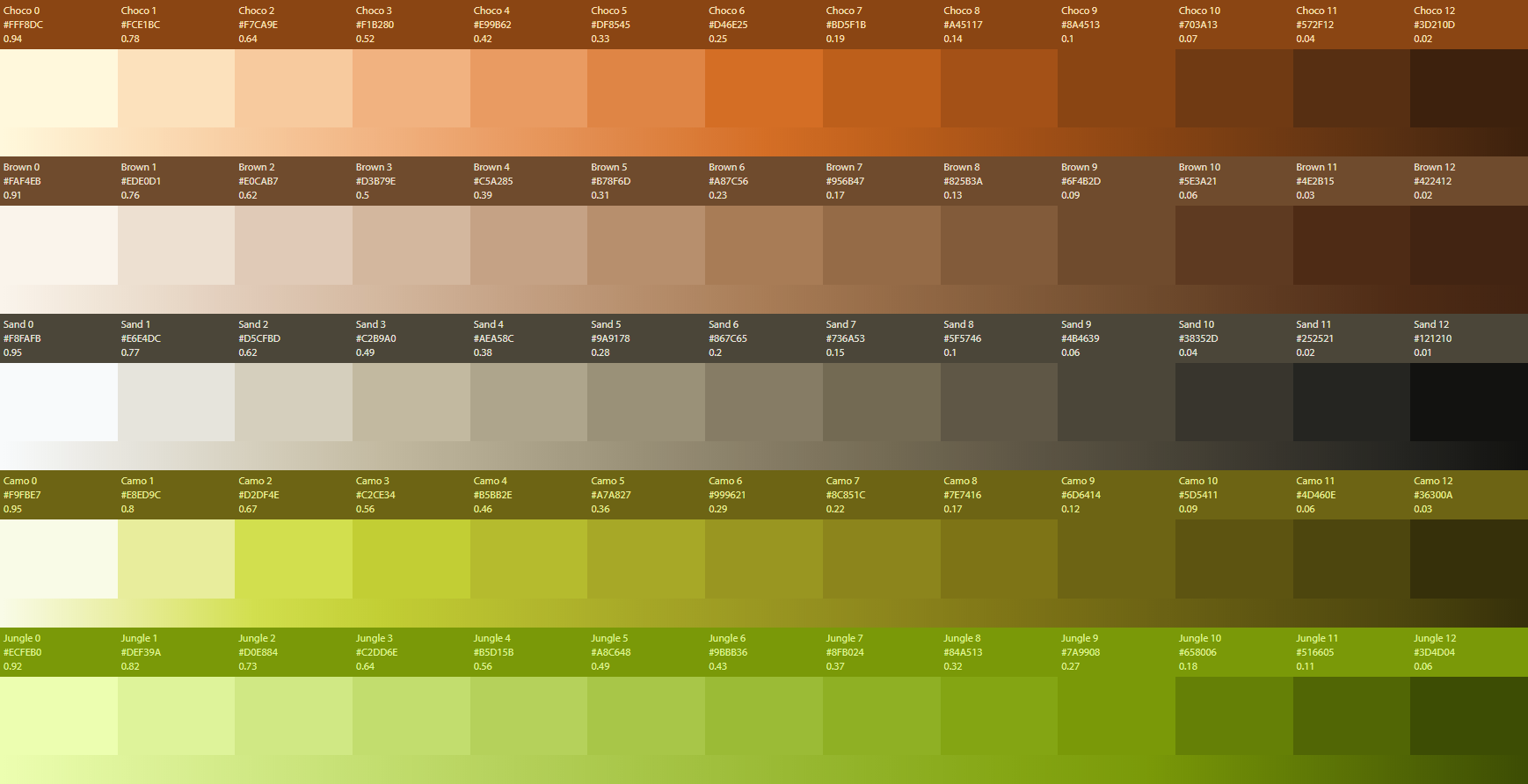
An explanation of each:
- Choco: A warm to hot brown. Open Color originally lacks any brown.
- Brown: A more neutral brown
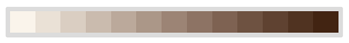
- Sand: A muddy gray-scale. Don’t underestimate this one, it scores spectacularly well when put to use. It has character.
- Camo: Not my favorite, but commonly seen, here called “Camo”, others may call it “Olive”.
- Jungle: Ignore this color, it’s a brand color for personal needs. If you use it, I will sue you with everything I got. Which is nothing.
As said, the last chapter of this article will discuss techniques to add your own hues.
Chapter IV: Testing and picking
This is going to be my favorite chapter to write as it allows me to show a lot of cool stuff. We managed to come to a large, attractive color palette that is useful for wide usage. We did so by standing on the shoulders of others (Open Color) and adding a few extensions.
This still does not satisfy all needs of the color-challenged. Colors only come to life when seeing them in action (testing).
And there’s another problem. Picking! With 234 colors in the palette, there’s still the task of picking good combinations from this subset. Which can be tedious, iterative work.
To deal with both problems, I’ve built an extensive suite of test tools and helpers. Unfortunately, it’s not open source as it’s part of a bigger project that is not open source. However, ultimately it boils down to the generation of some HTML and CSS from an array that defines the color palette. It should be easy to reproduce.
Let’s go. Be prepared for a LOT of color.
Ramp testing
A ramp is a set of tones of the same hue (so no accent colors from another hue) put together in a real-world test. Like so:

This particular test entails 3 different dark background tones, with various UI elements placed on top of it, at different luminosity levels. It allows for the quick discovery of the most attractive hues in a theming situation. Here’s all of them:

My personal conclusions based on this test:
- The blue hues don’t work well in this context, same for yellow and red
- Pink and purple are unexpectedly attractive, even if a bold design choice
- Other colors not mentioned yet are generally OK, a possible choice
- Gray, Lime, Choco, Chocolate and Sand rock. They are gorgeous.
Typography test
In this test, we’re using the colors of the palette as a foreground text color, on both a white and black background. In typography, the safe choice is to use gray tones for text, very dark or very light. This test aims to find out our options to add some color to that. Let’s start with a dark background:

On black, there’s a ton of options that could work, and quite a few gorgeous ones. In the previous test, the darker hues were winning but in this test, the middle vibrant hues seem to win. Even a troublesome UI color like yellow turns from weak to strong in this case.
Still, I’d use this in moderation. The trouble with dark themes is that almost everything is calling for attention.
The same test on white:

Quite a few options to bring some spark to your design!
Multi-hue testing
Now we come to my favorite part of the test suite. Our palette has 234 colors. If we want to discover an attractive combination of 2 colors, this leaves 234 x 234 = 54,756 options. So when color-challenged, you’d still struggle in finding attractive combinations.
No more. Or at least it has become far easier. In my test suite, I can click on any color in the palette. Next, a page opens with the selected color set as the background color. On the foreground, 234 color tones are shown on the selected background color. Example:

I intentionally picked a weird dark purple hue. As you can see, all 234 colors are laid out on top of it, allowing you to see the attractiveness of the combination. Not just that, also whether it meets AA or AAA contrast guidelines (marked by the green and red labels).
Here’s how this drastically speeds up selecting color combinations from multiple hues. Before, we had the intimidating task of picking from 54,756 combinations, with no idea where to start. Now, we break up this task into a series of much smaller choices:
- Pick main hue (1 out of 18, but based on taste you can dismiss several)
- Pick tone of the hue (1 out of 13, but more likely a choice of 3 or so tones)
- Check test page. Probably half of the combinations is invalid due to contrast issues. Another 25% will be impossibly ugly. Focus on the remaining 25%. Since you can scan so many options in such a convenient matter, you’ll find what you want.
To me this is a game-changer, that really solves picking color combinations. It’s not just speeding up the process, it’s also seeing options you wouldn’t even have tried in the first place.
As you would expect, the very bright and very dark tones of each hue deliver the most valid (contrast) options. An unexpected benefit of this tool, however, is finding the edge cases of the challenging colors. Those middle colors that are beautiful, vibrant, yet hard to work with as it comes to contrast.
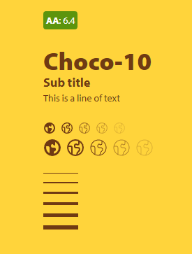
See example. Choco-10 on Yellow-4 pretty much creates the M&M brand, and it has excellent contrast. It’s not a color combination I would ever think of out of the blue, but this tool reveals it.
Here’s a true edge case:
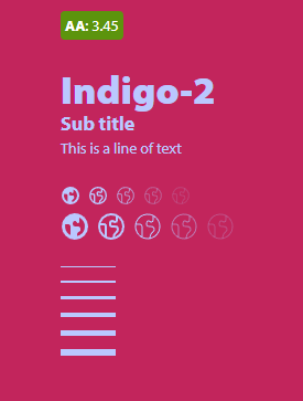
Indigo-2 on Pink-8. It’s bold, and not neccessarily attractive. The unexpected finding here is that it meets contrast guidelines, which I totally did not expect. It’s fun to find these edge cases and surprising outcomes. The accent testing tool not only speeds up color selection, it also is a wonderful way to discover them in ways you would never have imagined yourself.
Texture testing
The suite also has a test that does all of the above, yet mixes it with textures/patterns. For example, here’s a Sand-10 background combined with a subtle noise texture:

Shadow testing
A test to see how each color responds to an overlay shadow:

Or, a stage light:

Gradient testing
Gradients nowadays are a popular choice for backgrounds as they can create a beautiful ambience. Picking multi hue gradients that work is even more difficult than just picking two solid colors, because of all the tones that get generated in between. The test suite helps!
I picked a random color, Voilet-8 in this case. Next, the page generates gradients from Violet-8 to every other of the 234 colors in the palette. You can’t engineer a gradient, you have to see it. It reveals surprising and stunning results that, I keep repeating this…I would never have come up with myself. Another example, Cyan-6:

Isn’t that stunning? This is how I’ll pick gradients from now on. The best part is that I created the script to output this in about 3 minutes. None of the “Create your gradient here” tools can compete with simply seeing hundreds of them at once.
Generated atomics
Once you have a cohesive color palette for your needs, you could generate color variations of your atomics (low level UI elements). Nothing really stops you from doing this. For example, icons:

A more advanced test with color variations for strokes, including stroke width variations:

Or…buttons:

The point to generate atomic variations is not to offer this many options, it’s to discover the subset that performs best, rapidly.
Let’s wrap up coverage of the test suite. Needless to say, I’m very excited about it:
- It’s a drastic productivity boost for picking colors, combinations of colors, and gradients
- It is an awesome discovery tool to find artful combinations that also meet contrast guidelines.
Both directly address the pain of the color-changed: art direction and productivity. It’s the reason I’m writing this article.
Chapter V: create your own hues
Here we arrive at the final chapter in our lengthy tour of color. If this color palette still does not serve your needs, we’re going to discuss adding your own hues.
At face value, it seems a difficult task, since Open Color is based on hand-picked curves for each hue. Yet I found a way to do this relatively easily, leading to output that is attractive and is also consistent (enough) with the rest of the palette. It’s all made possible with this incredible tool:
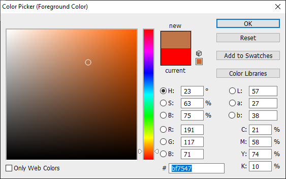
This amazing tool allows you to input a series of colors, after which the tool calculates all tones in between, in a way where luminosity steps are equal. So to create a brown, we’ll enter a very light tone of brown (#FAF4EB) and a very dark one (#422412), the beginning and the end of the scale.
First things first. How do we find these begin and end colors? The quickest way is to pick a color from the existing palette that is close. For brown, that would be orange. Next, take the lightest and darkest tones of orange and use a color picker to adjust the hue so that it becomes brown, whilst being at roughly equal luminosity levels as the orange we started from.
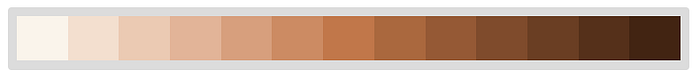
This should be easy to do, and after finding these two extreme values and entering them into the tool, setting the amount of steps to 13, we get this:
Not bad at all! If you’re happy, you can leave it at this. Personally though, I find the set a bit tame, it lacks character as found in the other Open Color colors. So let’s add character.
The tool generates hex values, and in its list of 13 values, we’ll copy the middle one, which is #9c8475.
Pay close attention as to what happens next. When I entered #9c8475 in Photoshop’s color picker, I checked the value of the Lab color system (to the right in the dialog). It’s L value was at 57. Next, I shifted my cursor around this color space to a more vibrant color in a way that L is still 57. A diagonal move further to the top and right, in this case.
We now have our “character” middle color, and next we add 3 colors in the tool: begin, middle, end. We let the tool do it’s job again:
A dramatic change in results. We have given color generation some artful direction. You could now stop, or take even more control. Instead of 1, you could create 2 control colors. If you do, make sure they are symetrical. With 2 control colors, the setup would be:
- Begin
- Control color 1 (at 1/3)
- Control color 2 (at 2/3)
- End
And you can do multi-hue too!

Check out this pink to purple hue, based on start and end colors already found in the palette. It’s unlike any hue found in the palette, and I totally would have added it had I not already prepped the palette for publication.
The final step is to place your new hue in the total color palette. In particular, we’re going to compare luminosity values at each stop compared to values in other hues. My rule of thumb is to not allow a luminosity deviation that is larger than 0.1 from the typical average lumination value of other colors at the same color step. If the deviation is larger, I may tune the color using a color picker, but only in tiny ways.
So to sum up the process of creating your own unique, beautiful hues that are attractive as well as consistent with the rest of the palette:
- Pick a begin and end color of equal brightness. Take values from a neighboring color and change the hue (and sometimes slightly the saturation)
- Enter the start and end color in the mentioned tool, set it to 13 steps, Bezier interpolation off, Correct Lightness gradient on.
- If happy, enter into color palette and test luminosity consistency. Tweak where needed.
- If not happy yet, add one “character” color to the middle. Find it by taking the generated middle color from the tool, add manipulate hue and saturation whilst keeping the L in Lab the same.
- Enter 3 colors into tool. Likely, you’re happy now. If not, change the color or consider two control colors.
- Once happy with the tool output, test and tweak luminosity values to integrate with the larger palette.
Seems like a lot, but with some practice, you’ll be creating new hues in a minute or so!
Wrapping up
In this vast article, I focused on addressing the needs of the color-challenged. Instead of inventing a new palette that can never outperform established choices, we learned how to judge the quality of a palette, and come to a primary choice: Open Color.
Extensions to this excellent palette hopefully make it even more widely usable. With a “universal” basis for color in hand, we don’t have to start from scratch.
Advanced testing and discovery tools shared in the article show a way to scratch another itch of the color-challenged: mass-generated combinations at a glance instantly reveal beautiful and valid combinations, and the discovery of original and unexpected combinations.
And finally, for the stubborn ones, we learn how it’s not that hard to produce beautiful, unique hues yourself.
So yes, at this point, I think we the color-challenged, can fake it. Thanks for reading:
Bonus: the below logo was created entirely of the palette discussed in the article, using Affinity Designer:

